HDRI – Blazing Sun – Lava Beach

GiantCowFilms posted this on Wednesday, February 14th 2018 at roughly 8 o'clock in the afternoon

4k-tonemappq

I was planning to open an HDRI store. That project didn’t pan out. I did merge some HDRIs, so I figured I could dump them here. If anyone has an undying love for merging HDRIs, I have a bajillion raw picks that could make some nice HDRIs in the right hands.

Download The HDR Now

For more information on how to use this HDR, read the instructions and FAQ

Specifications:
  • Licence: Creative Commons 0/Public Domain
  • Dynamic Range: N/A
  • Camera: Canon EOS 70D
  • Lens: Canon 10-18mm STM
  • Set EV: N/A
  • Coverage: 360 x 180
  • Date Taken: N/A
  • Location: Hawaii

This HDR captures the full dynamic range of the sun. It has a few weak points in the stitching and merging; however, it is still quite useful for most purposes.

HDRI – Sunset Skies – Prairie Hill

GiantCowFilms posted this on at roughly 7 o'clock in the afternoon

4k-tonemapp

Download The HDR Now

For more information on how to use this HDR, read the instructions and FAQ

Specifications:
  • Licence: Creative Commons 0/Public Domain
  • Dynamic Range: N/A
  • Camera: Canon EOS 70D
  • Lens: Canon 10-18mm STM
  • Set EV: N/A
  • Coverage: 360 x 180
  • Date Taken: N/A
  • Location: Northern Untied States

This HDR captures the full dynamic range of the sun. It has a few weak points in the stitching and merging; however, it is still quite useful for most purposes.

HDRI – Clouded Skies – Lava Field

GiantCowFilms posted this on at roughly 5 o'clock in the afternoon

4k-tonemapp

I was planning to open an HDRI store. That project didn’t pan out. I did merge some HDRIs, so I figured I could dump them here. If anyone has an undying love for merging HDRIs, I have a bajillion raw picks that could make some nice HDRIs in the right hands.

Download The HDR Now

For more information on how to use this HDR, read the instructions and FAQ

Specifications:
  • Licence: Creative Commons 0/Public Domain
  • Dynamic Range: N/A
  • Camera: Canon EOS 70D
  • Lens: Canon 10-18mm STM
  • Set EV: N/A
  • Coverage: 360 x 180
  • Date Taken: N/A
  • Location: Hawaii

This HDR captures the full dynamic range of the sun. It has a few weak points in the stitching and merging; however, it is still quite useful for most purposes.

Render created using this HDRI:

 c2-11

Rendering Stationery in Blender

GiantCowFilms posted this on Wednesday, September 21st 2016 at roughly 11 o'clock in the afternoon

Created upon request of johnp.

Difficulty level: Ultra-Beginner Blender Users. If you have any trouble following the tutorial, contact me, I’m happy to help.

No blender skills are expected except basic view port navigation. Photoshop or gimp skills are needed.

This tutorial is indented for graphic designers interested in using blender to create renders of branded stationery.

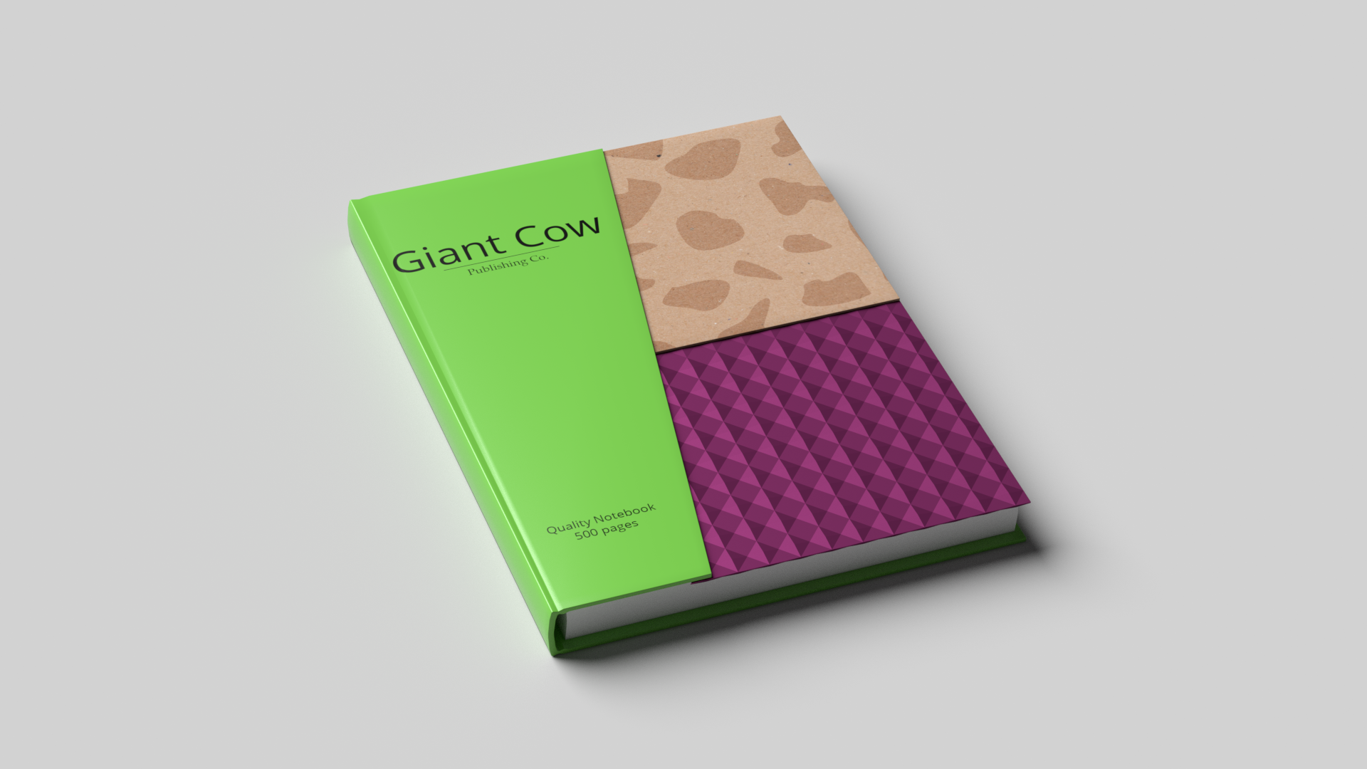
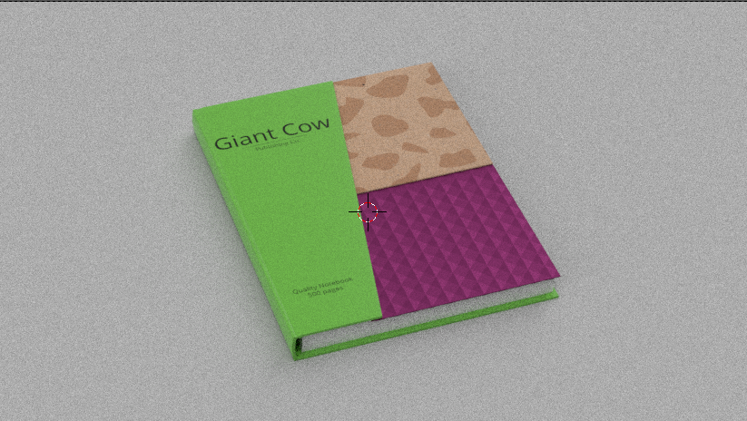
To demonstrate the basic techniques used to create product renders for stationery and similar products, an example of creating a simple render of a decorative notebook will be used.

render-4

Part One: Modeling

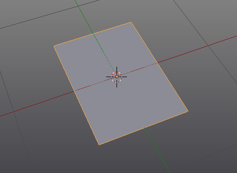
To begin modeling the notebook, add a plane ShiftA > Mesh > Plane

To begin modeling the notebook, enter edit mode with Tab.

select all the vertices and scale the plane down slightly (S), and then scale it down some more on the x axis (S), (X).

1

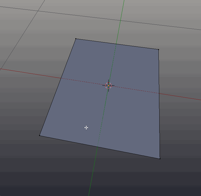
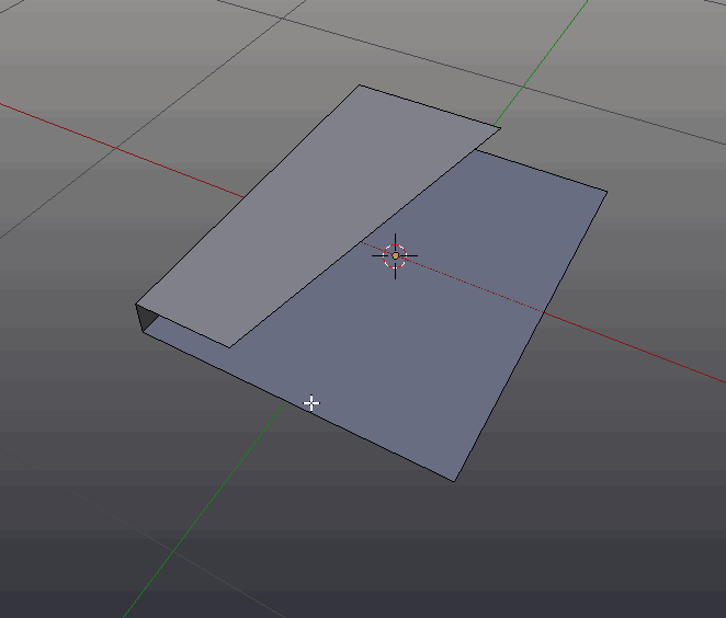
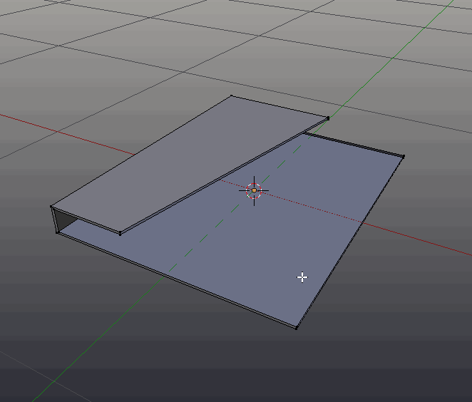
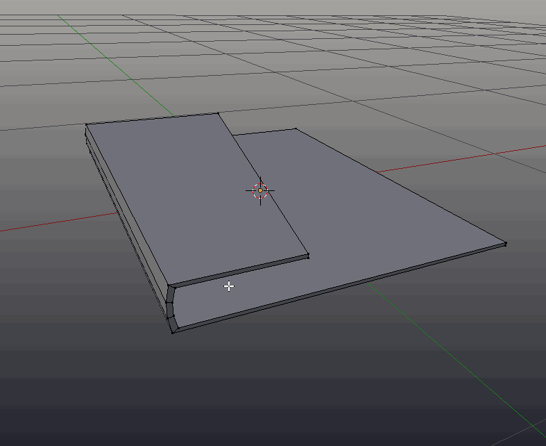
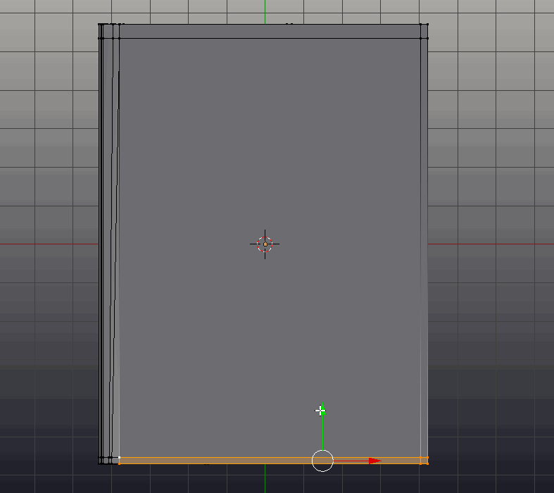
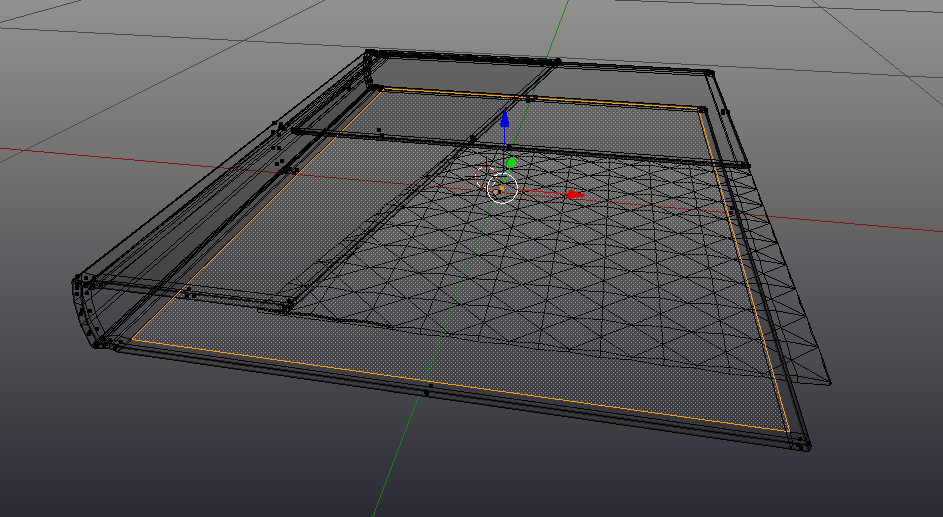
next, using Shift-RMB (Shift adds to the selection), select the two vertexes along the spine side of the book, and extrude them upwards along the Z axis (E)(Z) to the desired thickness of the book. Extrude them out again, along the x axis (E)(X), to make the green partial panel on the front of the book. Select the bottom vertex, and slide it back (G)(X) in to make an angle. The result should look something like this:

2

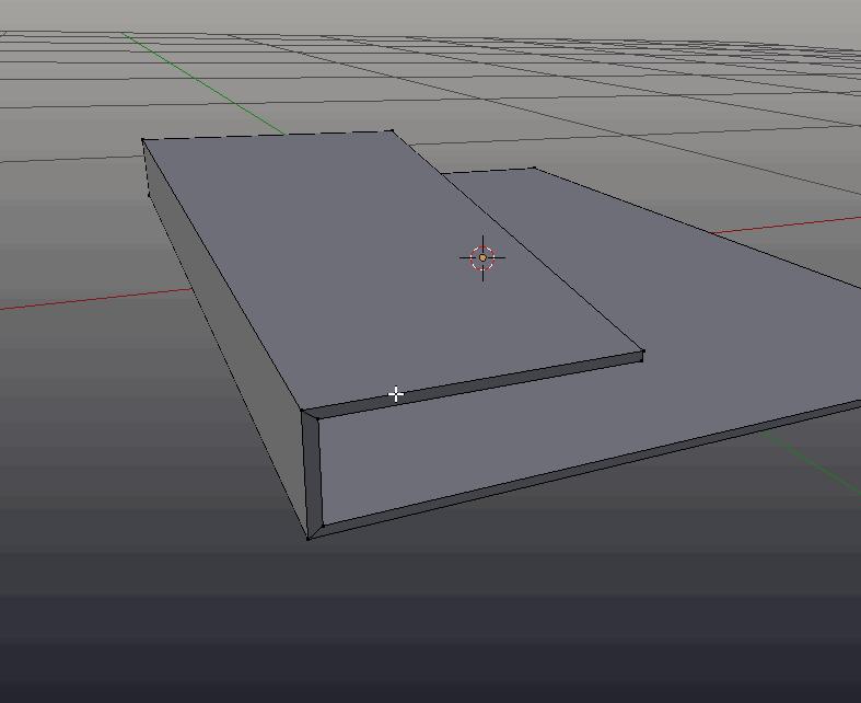
All paper has some thickness, and even if it is very thin, it is still important to model it correctly. In the case of the book cover, the paper is quite thick.

To add the thickness, select the vertexes along all the edges that will rise along a certain axis, and extrude those edges along that axis for the desired amount. For this purpose you may wish to use edge select mode.

3

4

It is important to ensure that the final mesh is clean and easy to work with, so that the later detailing steps can be completed without a hassle. Therefore, the overlapping corners need to be joined:

5

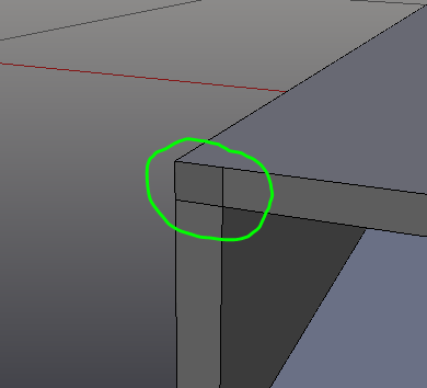
To achieve this result, switch into vertex mode, using the same selector that was used to switch into edge select mode.

Move the vertex of one of the edge over to where the other edge is. This task can be completed with more precision using vertex snapping, but that is not necessary.

Next, select the other vertex, and then select the moved vertex using Shift (so both are selected). Use (Alt)-(M)>At Last to join the two vertices. Repeat these steps for all the overlapping corners.

6

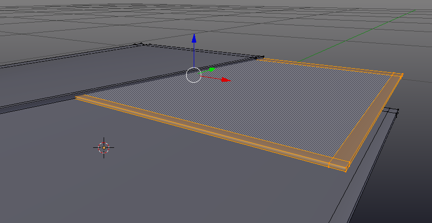
Now the back of the cover needs to be filled in. Select the four vertices that correspond to each of the interior faces, and hit (F) to make a face between them.

7

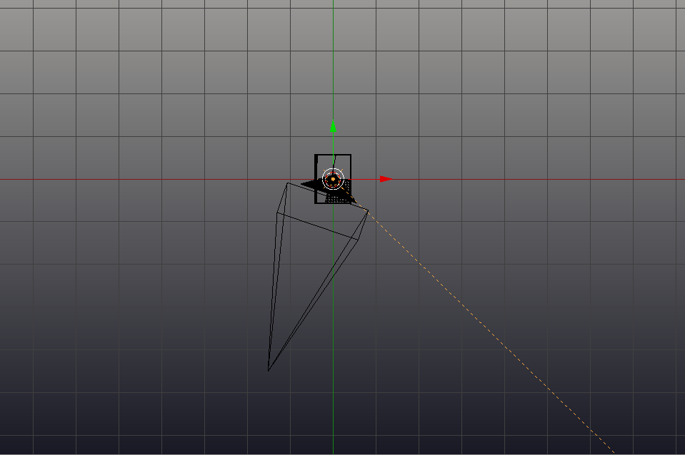
Now it is time to detail the cover, including adding a join and curve to the spine.

Begging with the curve, hover over the spine and hit (Ctrl)-(R), A purple line should appear parrellel to the spin. If it doesn’t move the cursor until it does. This can be a little fiddly. When the loop is in the correct place, use the scroll wheel to add another one, so there are two in total. LMB to confirm the change, then RMB to stop the loops from sliding. Two new loops of vertices will appear. Select them both (If they aren’t already selected), by Alt-RMB clicking on the first one, in the middle of the edge, and Shift-Alt-RMB selecting the other one. Finally, move them both slightly to the right of the book, to add a bit of curve to the spine.

8

Using the same loopcut tool, add the joint. Create a loopcut in the cover (Ctrl)-(R), this time with only one loop. Hit LMB to confirm the cut, and then slide it along, until its near the spine. Add another loop cut in the middle. Do the same for the back of the book.

9

Scale the two central loops together (select with Alt-RMB,Shift-Alt-RMB) along the Z axis (S)(Z), until there is a visible joint:

10

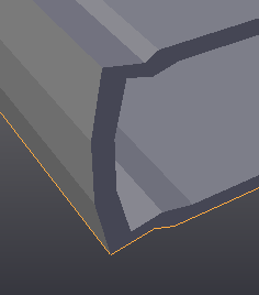
The edge of the spine appears to sharp. Select the edge on both sides of the spine, and bevel them using (Ctrl)-(B), use the scroll wheel to increase the amount of bevel.

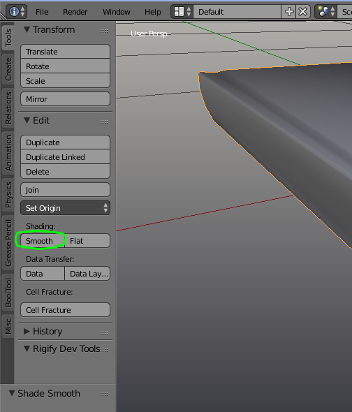
The cover is now ready for the finishing touches. The hard edges of the faces are visible. To rectify this, set the shading to smooth in the toolbar on the left side (accessible via the (T) key).

11

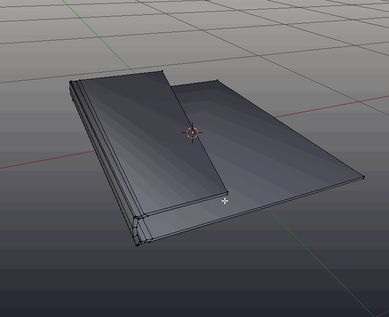
Next add some loopcuts around the edges, in order to ensure the smooth shading does not cause artifacts on the flat surfaces of the notebook.

12

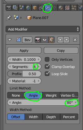
An important part of making any 3D object render realistically is getting the edges correct. Most paper products have very small rounding and the edges. Even though it is small, such edges can catch reflections and make a notable difference to the appearance and realism of the render. To get this rounding, a modifier can be used.

Add a bevel modifier, in the modifiers tab, and set the segments to four, the limited method to angle, and the limit angle to a number slightly smaller than 90 degrees.

13

The cover is now complete. Next the two decorative panels can be added. First the cardboard portion of the decrative panels will be created.

Duplicate the faces on the back cover up along the Z-Axis (Shift)-(D), and position it above the cover, so it is easier to work with.

Entering top view (Numpad 7), move the vertices on the bottom of the newly created plane up, to the point at which the cardboard should end.

14

Then add a loop cut (Ctrl)-(R) along the left side, so all the edges are held in place.

Select all the faces on the cardboard portion, by deselecting everything (A) will toggle the selection, it may need to be pressed twice, and then hovering over the portion to select, press (L).

Extrude it down (E)(Z) until it is slightly less thick than the cover. Select the entire portion with (L) again.

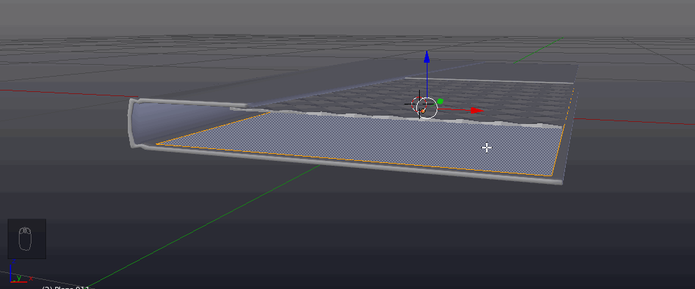
Move it down (E)(Z) until it is below the cover, but intersecting slightly:

16

Finally, the decorative purple portion of the cover can be modeled.

Hit (Z) to enter wire frame mode (Z can be used to toggle back to normal, solid, view mode).

select the two corner vertices of the cardboard inset, and duplicate them (Shift)-(D)(Y), down a bit. Hit (F) to create an edge between them, and then Extrude them along the Y axis down to the bottom of the book. Exit wireframe mode (Z).

17

Move the two topmost vertices a little distance inside the cardboard inset, so there is no visible gap. Select the purple inset with (L), and then use P>Selection to make the purple inset into a separate object, which will be easier to work with.

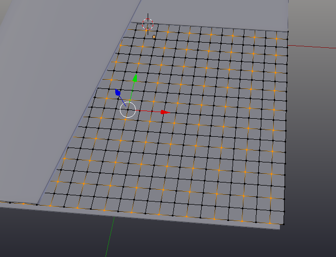
Exit edit mode (Tab), select the purple inset object, and enter edit mode again (Tab).

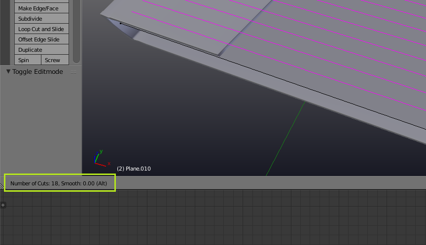
at 18 loopcuts (adjust the count using the scroll wheel) perpendicular to the book. The exact count can be viewed while using the tool in the bottom left hand corner of the viewport:

18

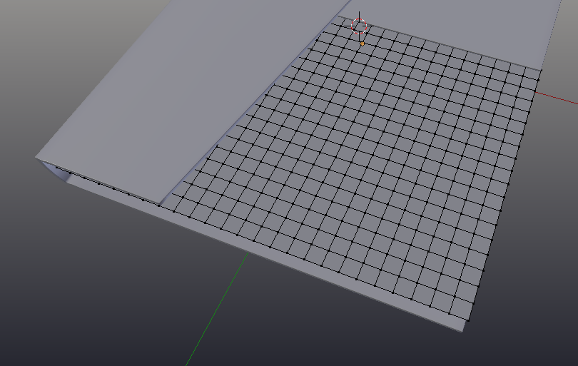
Add anther loopcut parallel to the spine of the book. Add enough division such that the spaces between the loop cuts and the perpendicular edges become squares:

19

the following steps to create this pattern are courtesy of gandalf3.

Next, create the pattern. Start by switching into edge select mode (Ctrl)-(Tab)>Edge

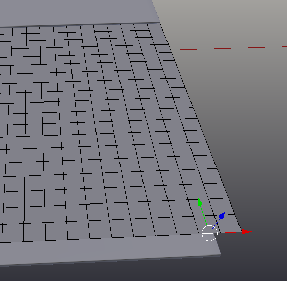
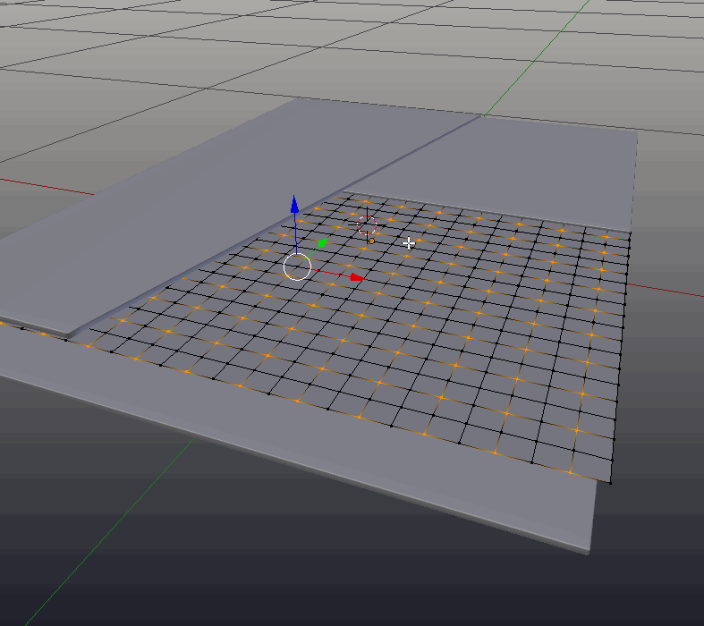
select an edge along the bottom of the pattern, avoiding ones on corners:

20

Hit (Space bar), and search for Multi Select Loops. Hit (F6), and check ring. Re-enter the spacebar menu, and search for and select Checker Deselect. Use multi-select loops again, this time, un-check ring. Switch into vertex select mode (Ctrl)-(Tab)>Vertex. Select a ring going in the opposite direction (Shift)(Alt)(RMB), and run checker deselect again.

21

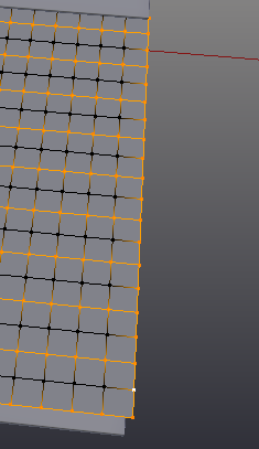
Select the perpendicular ring originally selected again (Shift)(Alt)(RMB), and deselect it (Shift)(Alt)(RMB). The selection should look like this:

22

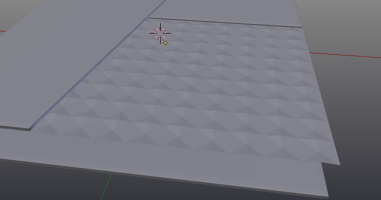
Next, move the selected vertices up, a small bit to make little “mounds:”

18

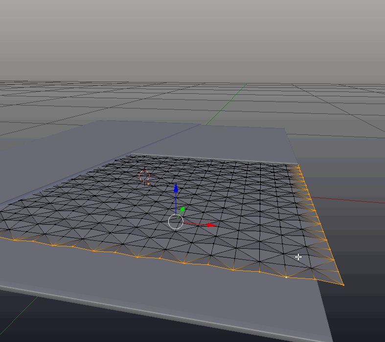
Select everything, and hit (CTRL)-(T). Out of edit mode the mesh should look like this:

23

Select the edges using (Alt)-(RMB) and then (Shift)-(Alt)-(RMB), and extrude them down, and scale to zero (S)(Z)(0). On vertices on the edge  where there are mounds, or the corner of mounds, move those vertices out slightly.

19

The modeling portion is nearly over. Lastly, the pages need to be added. Select the face on the bottom of the cover:

24

Duplicate it without moving (Shift)-(D)(RMB). Hit (P)>Selection, to make it a separate object. Exit edit mode, and select that object.

Deleted the bevel modifier, by entering the same tab and clicking the (X) icon. Then enter edit mode (TAB), and extrude up (E)(Z) the face until it meats the top cover. Add two loop cuts, and shift them along the (X) axis until the pages have a little bend. If the mesh appears dark an weird, use Ctrl-N the fix that.

25

Select the non curved faces on the mesh, and select them, and set the shading to flat (W)>Shade Flat

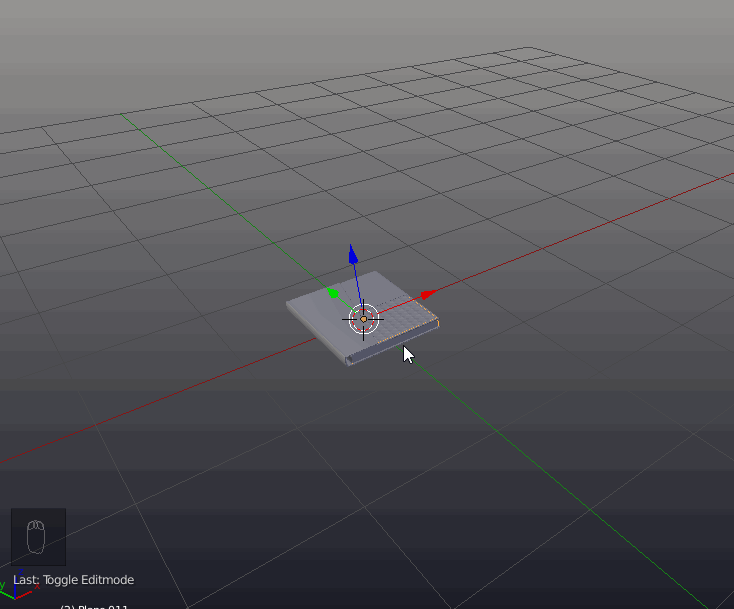
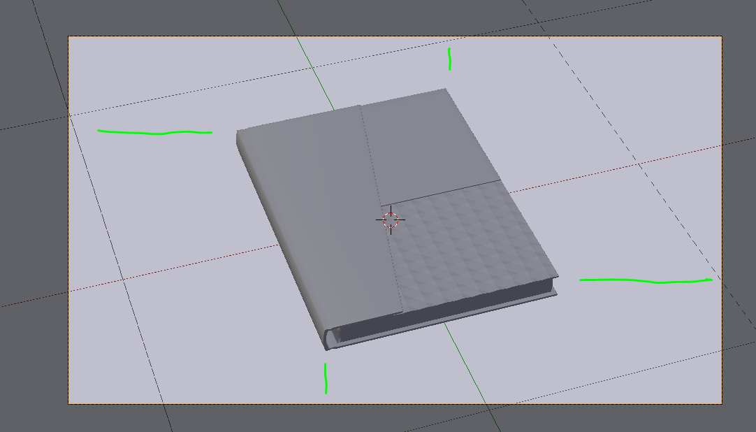
The book has now been modeled.

Part Two: Rendering

Recenter the 3D cursor with (Shift)-(C). Add a plane using (Shift)-(A)>Mesh>Plane.

Scale it up using (S) until it is several times larger than the book.

27

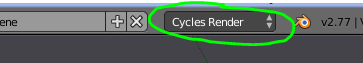
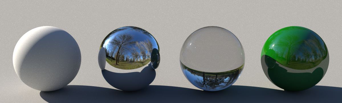
Be sure at this point that your render engine is set to the cycles render engine:

28

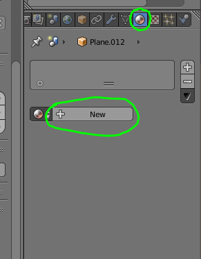
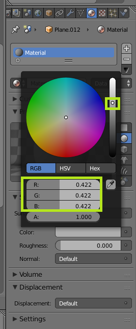
Add a material to the newly created plane

29

Make the color about a 75% grey, or about .5 RGB:

30

Before creating materials for the notebook itself, setup the lights and cameras, so that the material can be more accurately previewed. If there is a camera in your scene, delete it.

Add a new camera with (Shift)-(A)>Camera. Clear any rotation, position, and scale transforms, using (Alt)-(R), (Alt)-(G) and (Alt)-(S).

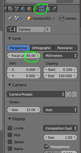
Next, go into the camera properties, and set the focal length to 85mm:

31

It (Ctrl)-(0) to enter the camera view. Open the properties panel (N), and check lock camera to view:

32

Position the view port to frame the book. Use (Shift)-(MMB) to pan. (G)(Z)(Z) will track the camera forward and backwards. Once the camera is positioned, un-check Lock Camera to View.

33

Note: When position the camera, try to get the margins as equal as possible.

Next, add a sun lamp (Shift)-(A)>Lamp>Sun

Rotate it by 45, on the y axis (R)(Y)(45). Enter top view (Numpad)(7) Spin it (R) until it is pointing into the bottom right hand corner:

34

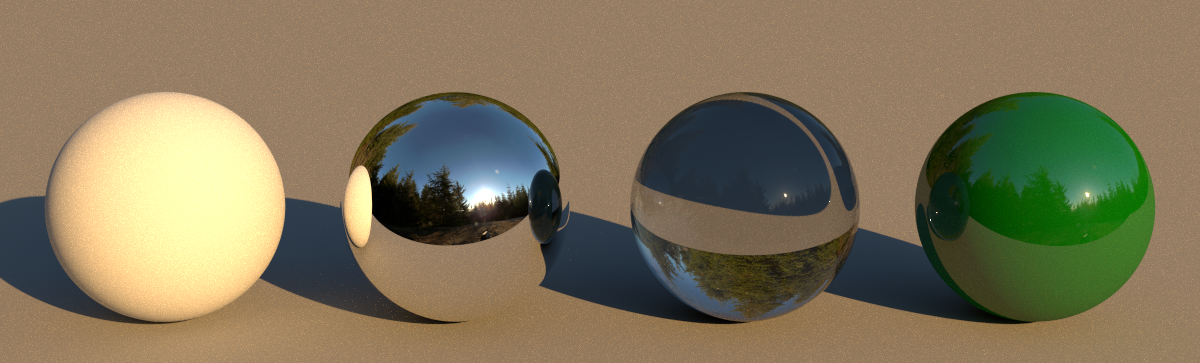
Move the lamp up, out of the way. its position does not matter as long as it is above all the objects that need to be lit. The sun lamp works well for this purpose since it creates completely even lighting across the surface of the notebook. Initially, however,  it creates shadows that are two sharp for product renders. This can be rectified by changing the size of the Sun lam in the lamp properties. With the lamp selected, enter the lamp properties. Set the size to around 0.45. Higher values will give softer shadows, this value can be tuned later if need be.

36-0 36-5 36-1 36-3

Here are examples with values of 0, 0.5, 1 and 3.

Set the strength of the sun to 6.

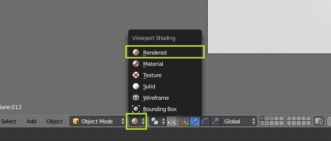
Now verify your setup. Enter camera view (Ctrl)-(0), and set your view port to rendered, using the shortcut (Alt)-(Z), which will toggle in and out of rendered view.  The view can also be chagned using the menu at the bottom of the viewport:

37

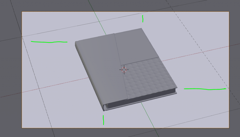
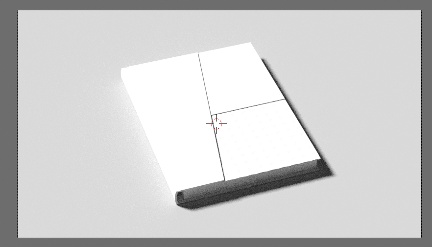
The setup should look something like this at this point:

38

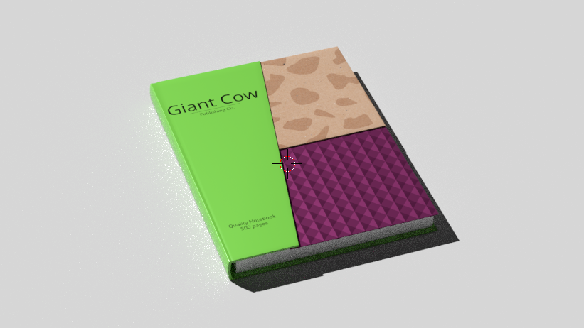
It is now time for the final steps, adding materials to the notebook.

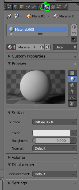
Starting with the pages, select it and add a new material, in the materials tab. Leave the material as default, it works well enough.

39

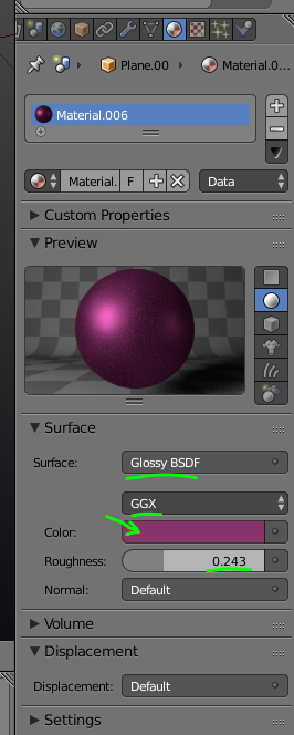
The next material will be the purple reflective pattern.

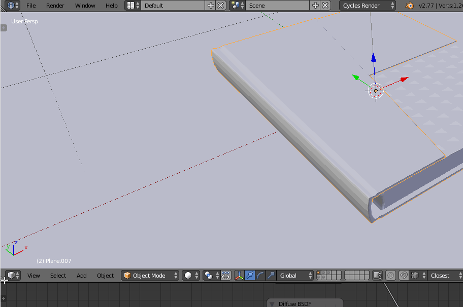
Select the purple inset object, enter the materials tab, and add a new material. Change the Surface from diffused to Glossy, and set the option under that to GGX. Next, set the color to a nice purple, the one in the example is #88346B. Next set the roughness to about .24

40

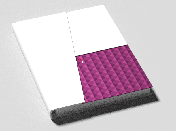
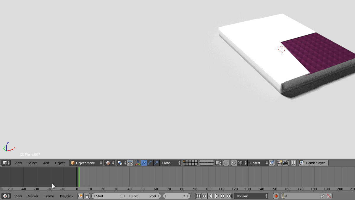
The book should now look like this.

41

Note: Better looking reflections can be achieved by rotating the light with (R)(R) and fiddling around a bit.

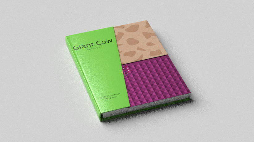
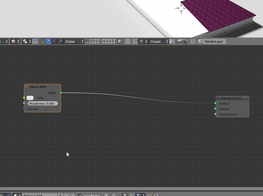
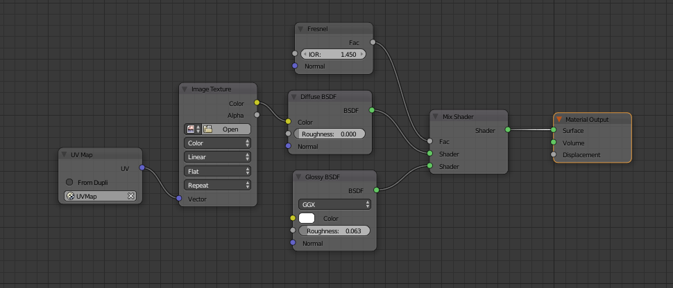
Now select the cover. Add a new material. Next enter the node editor:

42

Using (Shift)-(A), add a mix shader node, and a glossy shader node, and join them:

43

Next add a Fresnel node (Shift)-(A)>Input>Fresnel, and connect it to the factor input in the mix shader node. The Fresnal node replicates a property of physical objects where they appear to be more reflective at a glancing angle.

Change the color of the diffuse node two green (The example uses #70BC47), and set the roughness of the glossy node to around 0.06.

44

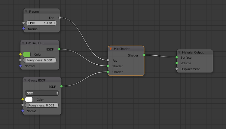
The book should look something like this now:

45

It is now time to add the text onto the Jacket, using adobe photoshop. First however, the book must be unwrapped in blender.

Open a UV Image editor window:

46

Next, click the plus sign to add a new image. Give it any name, and set the dimensions to 4096 * 4096, and set the generated type to UV Grid
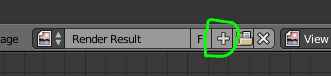
48

47

Select Ok.

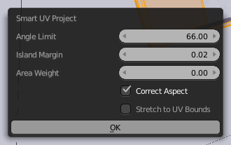
Next, select all the vertices on the book cover with (A). Hit (U)>Smart UV Project.

Select correct aspect (but not stretch to UV Bounds), and set the island margin to around 0.02.

49

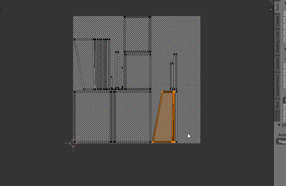
Turn on link selection if it is not already enabled:

50

Ensure that all the vertices are selected on the object in edit mode. If they aren’t, all the information in the UV Editor will disappear.

Look for the islands that correspond to the areas were the printed design will be added. Ensure they are oriented correctly. If they aren’t, select islands with (L), and rotate them using (R) and entering the number of degrees they need to be rotated.

51

Now it is time to export the layout to Photoshop, to be used as a guide in creating the cover design.

In the toolbar, go to UVs>Export UV Layout

52

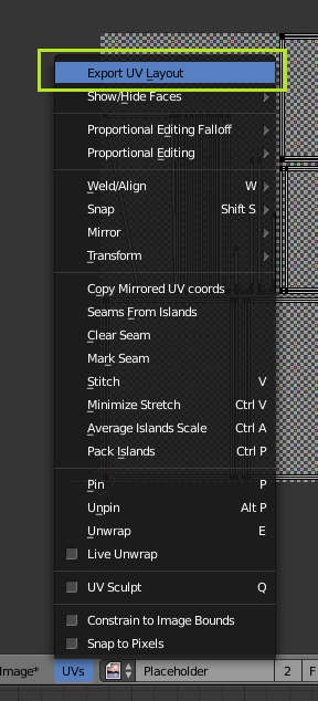
Save the file somewhere it can be found.

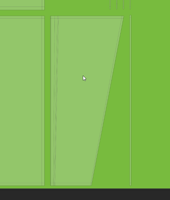
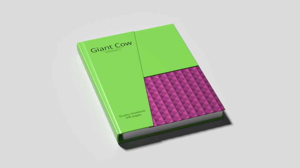
Open the file in Photoshop. Add a background, for the color of the jacket. Add text and designs over top. Use the layout as a guide to where text will appear.

53

Once the layout has been completed to satisfaction, hide the guide layer, and save the file out as either a .psd or .png, based on preference (blender can read both formats).

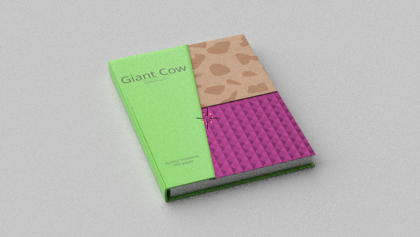
Back in blender’s note editor, add an Image Texture node (Shift)-(A)>Texture>Image Texture.  Drag it into the color slot on the Diffuse shader node. Next, add a UV Map node (Shift)-(A)>Input>UV Map. And select the only UV map that appears in the drop down. Join the node to the matching vector input on the Image texture node:

54

Click open on the Image Texture node, and locate the layout from Photoshop, and select it.

The book should now look like this:

55

The Final Portion of This tutorial, adding the cardboard inlay, will be added soon. I also intend to add a section on modeling the stationery to precise real-world scale values, and a section dedicated to creating stacks of thin paper, which provides a few unique challenges to beginners.

Tags: , , ,

Star Wars VII – The Characters without the Magic

GiantCowFilms posted this on Friday, December 18th 2015 at roughly 4 o'clock in the afternoon

Star Wars Episode VII: The Force Awakens, is probably the most anticipated movie of all time. Following a set of three heart breaking failures at the hands of the once revered master creator, George Lucas, this film has to succeed. Hopes are high, and the trailers were well received; however, there are some good tip offs that this film still won’t capture the magic of the original trilogy. It won’t be a outright failure like the prequel films, loaded with bad action – probably it will be the best movie of 2014-2016 – but it won’t compare up to three of the most iconic films ever made, due to some poor stylistic choices.

The original Star Wars films were perfect films. prefect – not as in without a mistake (looking at you, storm troopers), but perfect in the sense that they had the magic. There was something right about those movies. They were dreams made real. The important word here is real. Previous science fiction & fantasy films were made to feel incredibly artificial. These B-movie style films, were extremely campy, designed for cheap entertainment. Featuring characters that appeared to be strait out of a comic book, sci-fi films of the sixties and seventies were made with little thought or artistic enterprise. This all changed when a small film with little hope for success came onto screens, Star Wars.

The concept behind Star Wars was to take classic story features, mostly sourced from mythology and folk tales, and then put a new action-adventure spin on them by setting it in space. This on its own is not entirely revolutionary. The revolution came from how Lucas chose to shoot Star Wars.

Rather then creating a surreal abstract slightly bizarre future like the science fiction films before Star Wars, Lucas wanted his film to feel more like a fantasy film set in the past, hence the iconic opening text “a long time ago in a galaxy far, far away”. He choose to make a universe that is real, alive. This was manifested in every single production choice, production design, sound, cinematography – everything.

The idea was to make a very lived in world, What Kurosawa would call a maculate reality – you know I was very conscious of that when I made the movie I wanted to make a world that absolutely looked like it had been lived … it’s a real ship that has been lived in for a long time… I wanted to create a world that was lived in and had a sense of realism about it
 – George Lucas, DVD commentary

“George wanted what he called an organic sound track – that is he wanted the sounds in the film to sound natural. He wasn’t interested in what was the tradition with previous science fiction films which was to generate electronic sounds and synthesize sounds that would have an other-wordly quality. He wanted the sounds to have a worldly quality – that they would sound like real objects, real motors actual places – the doors would be rusty on the spaceships.” “The engines would sound like they were mistuned or backfire once in a while.” “He wanted a used universe”
 – Ben Burt – DVD commentary

It wasn’t that Star Wars was ahead of its time, which it was, so much is that it was done fundamentally right. Through accident as well as understanding (though considering the prequels, I’m thinking accident), George Lucas made the “perfect film” not only did it have strong characters and deep philosophical roots, but it was also unique on the surface level. It was believable and real. That is its secret sauce, as a fox executive noted in a telegram after watching a half completed rough cut of the film:

“They claim the picture has a look never see on the screen before and that is is so believable you never feel it is other than the present even though the location and equipment are space in the year 2000 plus”
“It is so realistic … that you really do become involved with and care about all of the characters.”
– Peter S. Meyrs. Tellegram

The new film, will have those same plot underpinnings, and will probably be, as a result, one of the best films made this year. However, a strong plot is not enough to make a film great. The prequels had a surprisingly strong plot, The issue was it was buried under other filmmaking disasters – bad acting, over focus on action, and a couple of unnecessary characters. This new film won’t suffer from the same mistakes, since the filmmakers fear for their lives, but it will have roughly the same general affliction. That is lack of the magic.

This time the mistake will be in the design and film style. Realism is one of the key pieces to the Star Wars magic, and the new film is showing a startling lack of it. The trailers which can actually be a very good judge of the film style, since every shot follows that style and extrapolating backwards is quite simple. All that is needed is a variety of shots from different scenes of the film. The biggest flaw is not use of CGI, which isn’t inherently bad, but from the mis-use of CGI and other simple things like shot composition, lighting and colors.

J.J. Abrams is largely to blame for these mistakes. He has this unbreakable need to place his film style, which is defined by doing everything bizarre and unconventional. At one point this style was cool and unique, but it wears old. Bringing to much attention to the camera, this style acts as a spoil to that all important realism. Dramatic angles have a home in the language of cinema, but Episode VII is not included. These “creative” stylizations distance the audience from the characters and stories in a subliminal way.

Here are several examples of these stylized shots

Telephoto-Disaster Color-Disaster-1 

They are in no way or respect believable or real. It doesn’t feel like you could be standing there in the same way the original film does. Instead Episode 7 is a landscape of digitally created colors shot in a bizarre perspective.

This is pretty unforgivable, but the final straw is this shot:

CGI-Falcon

It is plagued with something that has become prevalent recently in holly wood movies: I call it rubber action. This style was epitomized in the Hobbit films. It is when directors use CGI to create action scenes that defy physics especially regarding motion and durability. In this instance the falcon should not be surviving that impact with the snow or trees it should totally be smashed. One could argue it ought to explode true Star Wars style – on impact (seems unrealistic but it also feels natural, and considering what kind of generators and such are needed for hyperspace, probably isn’t totally implausable). The point is it definitely shouldn’t be bouncing like a rubber ball.

In the end the film should have been shot in the style of the original, without creative angles, shaky camera or other subliminally unrealistic creative choices.

J.J. Abrams has said in interviews again and again that he is avoiding CGI when possible and trying to build real sets. In the end though, “when possible” is meaning less, since its those impossible cases that are the real issue. CGI set extensions are harmless, invisible and have little impact. Nothing compared to the overkill coloration and cinematography of the final film. J.J. failed to get the realism that motivated him to avoid CGI.

All this being said, how much will it impact the film? This will depend largely on the viewer. Not everyone experiences movies in the same way. To some, a film is all about the characters, who they are, what they look like and what they say. They won’t notice the effects and action as much. Personally, the appearance and sound of a film is most important. Its what the shots look like defines how I perceive the scene. This is why J.J. style ruins the film for me. It has a fake and stylized look, which makes the film appear fake and stylized. Whether the film is enjoyable depends on how you will watch this film. I feel one thing is fairly certain though. The film could have been much better if the filmmakers had stuck with the look and feel of the originals – a tried and tested look, that was loved (subconsciously at least) by audiences all over the world.

The new Star Wars film will still be one the best of its style with a strong plot an engaging characters. But it wont be timeless in the same way as the first ones. It will still fall short of the magic.  However, there are still two other Star Wars films, and there is still new hope for the magic of the saga. Everyone wants a different experience from a film, and this film may be considered by some the best Star Wars film yet, but for me and others who expect the same as before, it won’t hold the magic.

Tags: , , , ,

How to increase readability on a website

GiantCowFilms posted this on Monday, December 7th 2015 at roughly 2 o'clock in the afternoon

Fonts are generally the key; however, changing fonts isn’t always so easy, and often it seems like it doesn’t help. This is where one simple trick comes in: Increasing the line-height.

This can be done using the css property

{
    line-height: 20px;
}

which will set the line height of some text. The line height is the amount of vertical space text consumes. Here are two examples with different line heights, the first set to 15px, and the second set to 35px.

Towering hundreds of feet into the sky, Giant Cows have giant needs. Infact, a Giant Cow can eat up to 20 tonnes of small vegetation and trees in a day. Furthermore they often will graze over a hundred square miles in a day!Commonly inhabiting areas lush with vegetation, Giant Cows can be found on nearly every continent. Scientists have often had trouble explaining this phenomenon, since it is unlikely they could have swam.

Towering hundreds of feet into the sky, Giant Cows have giant needs. Infact, a Giant Cow can eat up to 20 tonnes of small vegetation and trees in a day. Furthermore they often will graze over a hundred square miles in a day! Commonly inhabiting areas lush with vegetation, Giant Cows can be found on nearly every continent. Scientists have often had trouble explaining this phenomenon, since it is unlikely they could have swam.

Getting the right value depends on the font height, but generally +5-6px produces the best results. If making these changes still doesn’t help, it is probably worth looking into changing the fonts.

Tags: , , , ,

HDR: Evening Sun

GiantCowFilms posted this on Tuesday, December 1st 2015 at roughly 3 o'clock in the afternoon

preview-tone

This image was tone mapped for previewing. view the non-tone mapped preview here

Download The HDR Now – 19.1 MB

For more information on how to use this HDR, read the instructions and FAQ

Specifications:
  • Licence: Creative Commons 0/Public Domain
  • Dynamic Range: 20.46 Stops
  • Original Size: 29184 x 14592 – Uploaded at 12.5% original resolution
  • Camera: Canon EOS 70D
  • Lens: Canon 18-135 STM
  • Set EV: +13.988 @ 100 ISO – You can adjust the exposure after the fact if you need
  • Coverage: 360 x 180
  • Date Taken: 11/29/2015 2:43 – 2:59 PM
  • Location: Northern United States

This sun-capturing HDR has a full 360×180 range, and stores the light found in the early evening. In this one the color of the sun was tuned for best results.

Test Render @ 8,192 samples

 preview

Lessons Learnt

The sun in this one was a little desaturated, and I think it was due to lack of sufficient ND filters. I need to go down about 2-3 stops. The problem is, at around this point, IR light starts to flood the sensor, and ND IR filters are quite pricey, so for now I will tweak the color of the sun in post. It may seem “inaccurate” but as long as the desired light, colors and reflections are achieved, no harm has been done.

Tags: , , , , ,

HDR: Direct Sun

GiantCowFilms posted this on Friday, November 27th 2015 at roughly 4 o'clock in the afternoon

thumbnail

Download The HDR Now

For more information on how to use this HDR, read the instructions and FAQ

Specifications:
  • Licence: Creative Commons 0/Public Domain
  • Dynamic Range: 21.07 Stops
  • Camera: Canon EOS 70D
  • Lens: Canon 18-135 STM
  • Set EV: +13.99 @ 100 ISO – You can adjust the exposure after the fact if you need
  • Coverage: 360 x 180
  • Date Taken: 11/26/2015 11:26 – 11:41 AM
  • Location: Northern United States

This HDR has a full 360×180 range, and captures the light near mid day (the sun is still angled since it is winter, and the location is fairly far north).

Test Render @ 2,048 samples

 preview

Lessons Learnt

Trying a new bracket merge algorithm, seems to work better, but still room for improvement, especially regarding ghosting. Again this image suffers from ICE image stitch errors, which seem to be particularly bad across brackets, as if ICE changes the stitch for different brackets, even though it shouldn’t be.

Tags: , , , ,